
‘Can an unused feature make you a better Designer?’
Role
In-house designer for Cadent, [advertising
technology platform]
Tools
Sketch
Abstract
Trello
Timeline
6 months to a year
Deliverables
an internal and external ‘Plan View’ for our web platform
📡 A a little bit about Ad-tech:
Cadent’s platform enables media buyers to purchase ad space for 75 million devices across a multi-channel network. I’m currently leading design for a product called Addressable television.
‘ATV’ allows agencies to identify high-value households and send messages to viewers directly if they fit the targeting criteria.
Essentially, if you’re in their desired demographic (narrowed down through our various data streams).. we could nearly guarantee we’ve made an impression on your household. Impressive, right?
Our planning tool covers the entire lifecycle of an Addressable Campaign:
👫🏿 Creating complex Audiences and Forecasting their reach
🏦 Setting Budgets and Timelines
📤 Creating a final Media Plan and sending it to Order
📑 Seeing Reporting results and comparing to estimations
The TV industry changes rapidly. We had clients that once came to us for Cable and Broadcast ad space coming to us now for air time in places like Hulu and Disney+.
And they didn’t want to just buy it from us, they wanted a way to buy it on their own.
👩🏼💻What our team aimed to do:
Our platform needed a way for those new media buyers to now log in and see a plan that was created by our media sellers.
We also wanted to give the external buyers a way to send feedback for adjustments to the plans our team sent. Likely the tweaks were about Budget or amount of times the ad would run in a day, also known as Frequency.
The problem: there was a TON of proprietary data (and insider secrets) our clients could not have access to. How might we grant the potential buyers just enough access to our internal planning tool so that it is a win-for-them while remaining safe-for-us?
Our goal was to create two separate views for each user:
📂 One with full planning functionality and admin controls
📁 The other with a limited view which received the recommended plans
Though Cadent’s plan view was relatively established, we would need to start from scratch for our external user’s view. Design and Product worked together to create a layout we ended up calling.. ‘The Dashboard’.
But what happens when the TV industry takes another sudden pivot?
-
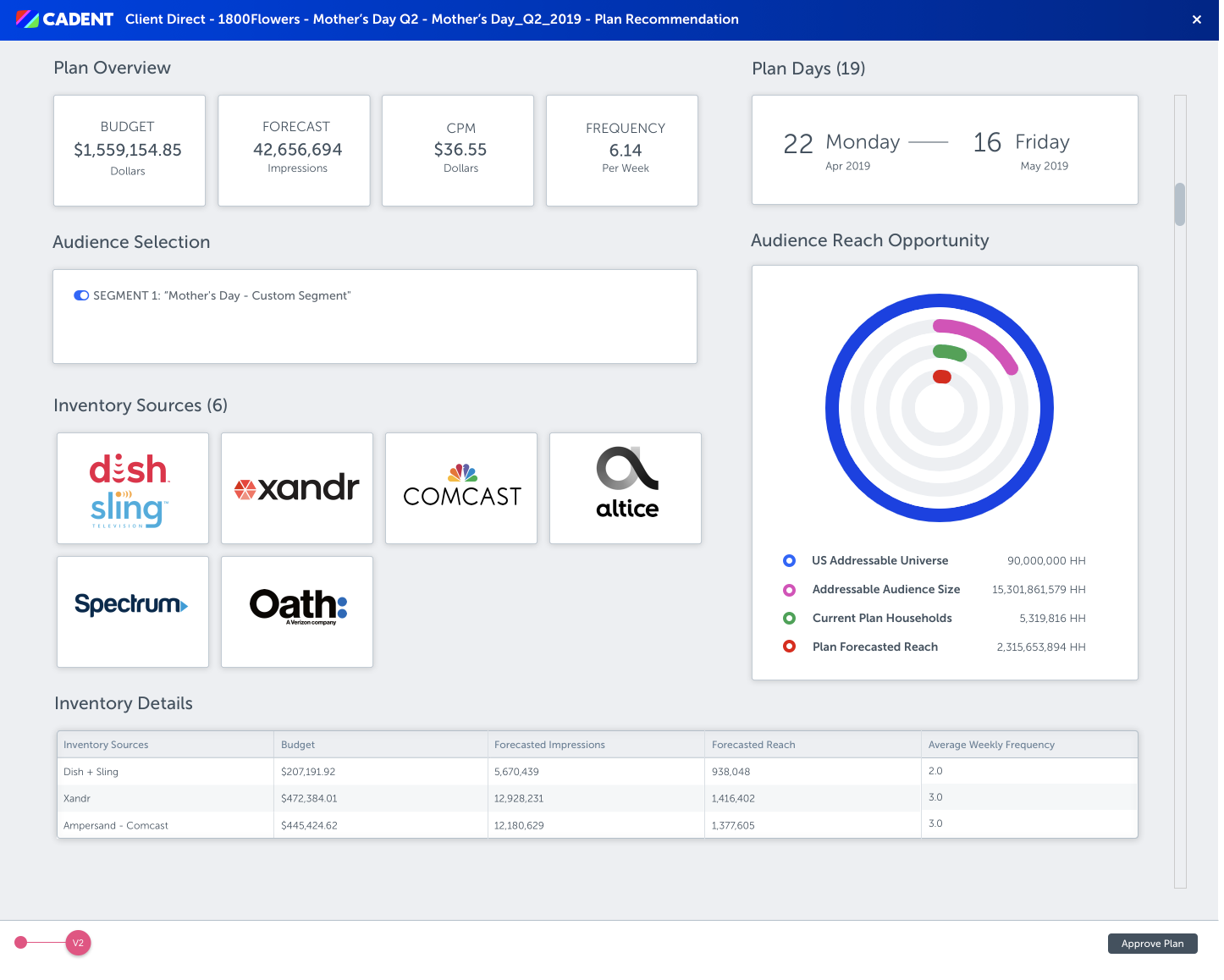
Internal View

-
External View
The Scoop:
Well as you could have guessed, eventually a new business model took hold.
Change happened 🚀and we had to adjust.
A few major agencies were blocking our efforts and in turn our clients could not justify our fees as a Managed Service for buying Addressable ad space. And since we could not simply hand over access to our internal planning tools.. We had to completely re-route our roadmap. We eventually became a Self Service platform. We acquired companies, we rebranded, we were agile.
But what about the project we’d tirelessly reiterated?
-

Whiteboard Session
With our feature notes in hand, I drafted the concept on our cubicle board. As the days went by we made slight adjustments until the layout felt right between Product, Engineering, and Design.
-

First Mock Up
Our first go at this view was busy and had been early in our rebranding process. The styles are drastically different from our current look and feel but overall still a Dashboard for external clients.
-
Early Mock Up
This design has all of the right elements like the chat feature, interactive visualizations, and attractive data points. The styles and typesets were still different due to a rebrand.
-
Iteration 1
The initial version had a lot of what the early mocks had: widgets, comment feeds, graphs that showed reach, inventory sources in a carousel, a versioning component..
-

Iteration 3
In this screen we were trying out a new grid while adding a gray backdrop to give emphasis to details on the widgets. Our audience reach graph had a new bold look.
-
Iteration 7
By this iteration we had finally landed on what the layout should look like. Specifically, the data visualization graph .. which ended up being nicknamed ‘the Bullseye’. Here we de-scoped the commenting feature too. All in all, the Dashboard was taking shape.
-

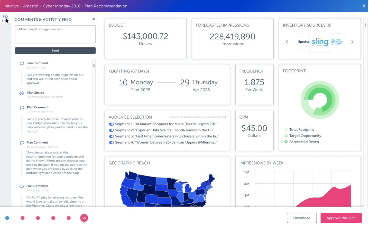
Iteration 8
The chat feature was back! The carousel of inventory sources was back! It was rewarding reusing widgets we’d previously built and spent time on. Their flexibility was essential in this grid style as we started using responsive design.
-

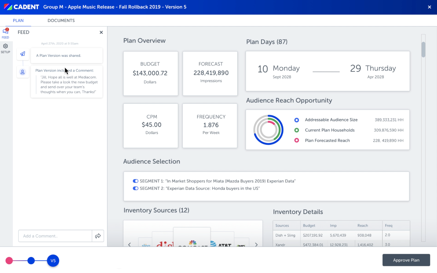
Iteration 11
We’d really honed in on every widget, adding complexity to each of them as we went along. Here we added campaign milestones to let the user know how their campaign was doing.
-
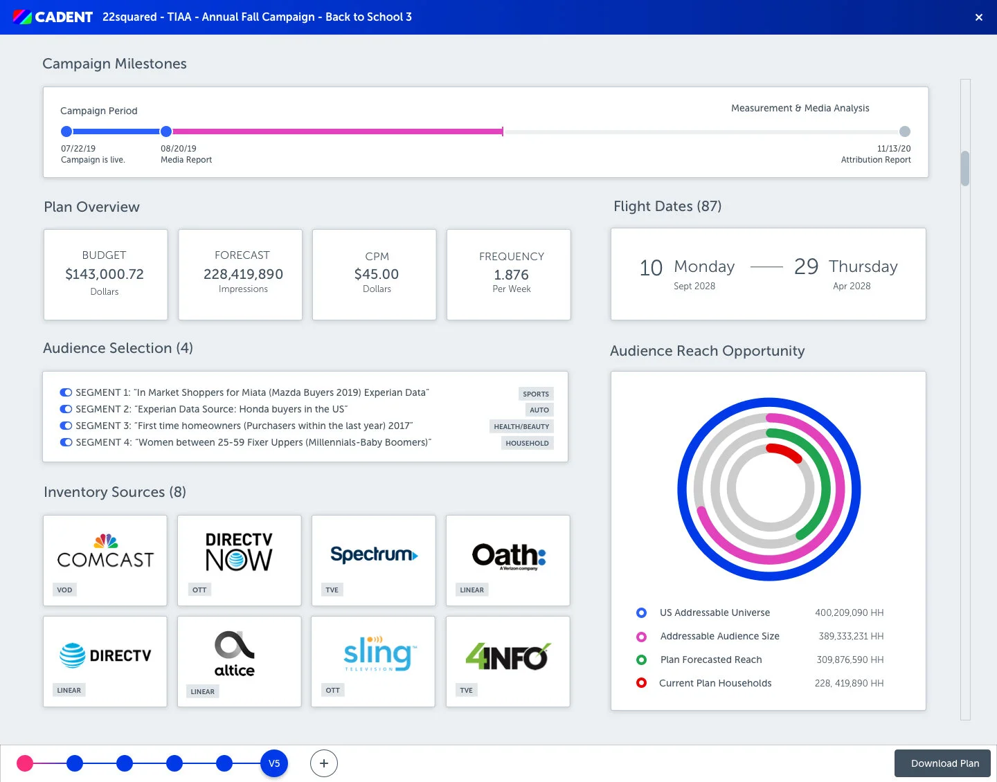
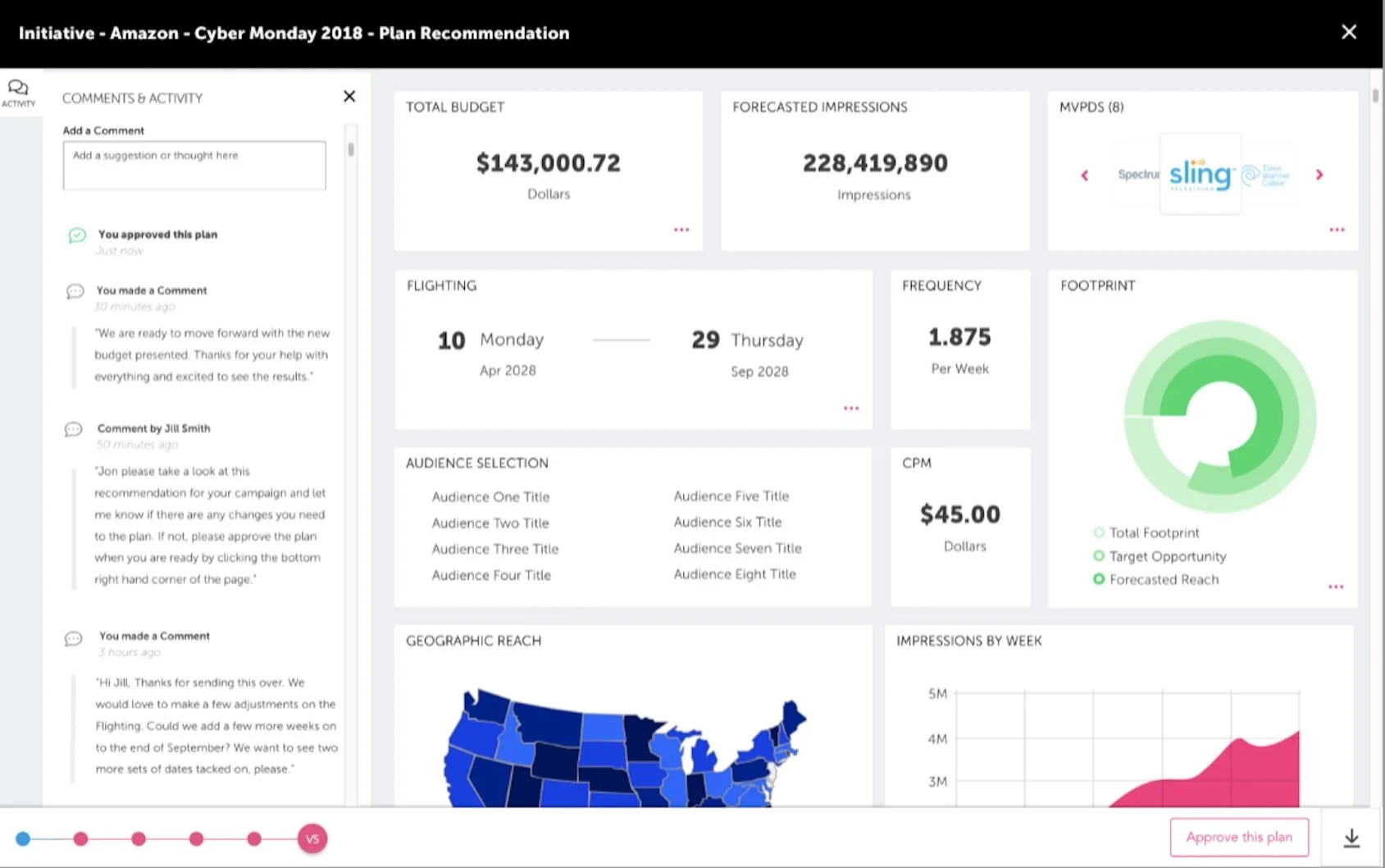
Iteration 12
This was the last we saw of the beloved Dashboard. We made a few adjustments on the campaign milestones to add dates and descriptions. The versioning component was back in play at the bottom of the screen as well.
Widget Exploration
-
![]()
Early Milestone Concept
-
![]()
Milestone Breakdown


When we talk about where we went wrong, we’re not talking about the user interface, and all those fancy gradients and graphs. We’re talking about the usage in the real world.
💔 Our Mistakes:
We were not great listeners at first.
Sure, we knocked out hefty requirements as they were given to us. And yes, the platform goals needed to change with the new company strategy.. but we missed something the initial time around. We missed getting to know our users really really well.
Had we started with those in-depth interviews, user flows, and ‘how-might-we’ exercises maybe things would have gone a lot smoother. Maybe we would have realized our model probably wasn’t going to be the best tool for both sides of the coin..
Additionally, we lost a lot of time perfecting fancy looking widgets. Did anyone end up using them? Unfortunately, no.
It didn’t matter how flashy or great the beveled edge was on our data visualization cards — we didn’t test them with our future clients or even our internal teams.
🔎 The Takeaways:
I’d like to consider it all practice.
It was helpful for me to design so much of ‘The Dashboard’ as a way to gain experience. All of those hours I spent creating and getting feedback finely-tuned my skills with visual UI. Times when I wasn’t sure how a component would behave I turned to engineers and coworkers for advice — I became a better collaborator and student. My architecture skills were pushed thinking about the end-to-end system as a whole, and then where my feature fit in.
I came to realize: this field is a practice.
We are not our designs. We are how we unravel problems, we are how we generate ideas; how we transparently share our works-in-progress..
Most importantly: we are how we take lots and lots of input and put it back into our designs. Even, if the input says: ‘Hey, you might have to start over.’
New Exploration and Research:
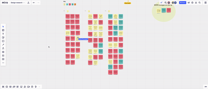
Affinity Exercises were done in Trello and Miro
Several User Interviews later, we had a new map of our Internal Buyers’ happy path.
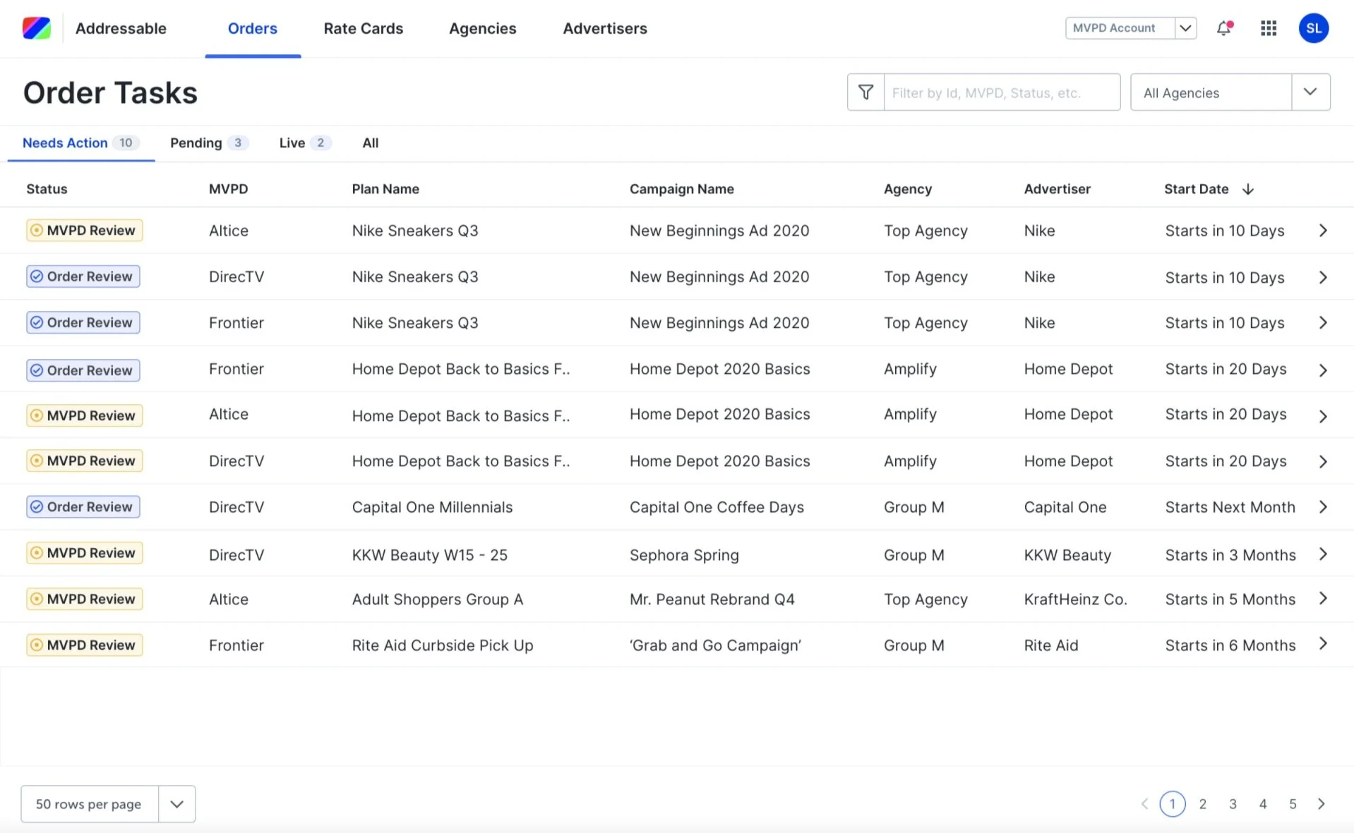
We built a limited access ‘Client Inbox’ to replace the Plan View so users could see their Orders and take action immediately
Status Workflows for Internal Users
Status Exploration
The Results: